Lecture 5. Screen & Print
Font that commonly use for printing: Caslon, Garamond, Baskerville
ELEMENTS THAT WE CAN SEE IN SCREEN:
Hyperlink: Click to jump to a new document or section
Font: Frequently use 16 pixels text
*Georgia and Verdana are both invented for screen.
*Pixels on different devices are different.
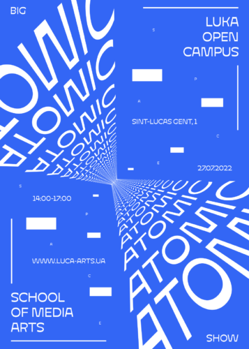 |
Fig 1.3: Reference for Motion
|
STATIC VS MOTION:
Static: Express using traditional characteristics such as Bold and Italic
Motion: Has more dynamic and more expressive, includes more 'dramatic' element to let the words become 'fluid' and 'kinetic'
*Use in music videos and advertisements
2. INSTRUCTIONS
3. PROCESS WORK
3.1 References
1. This reference inspired me to make the 'UNITE' to look like a fist.
2. This reference inspired me to come out a new sketch (Layout 5 in the new sketches section). It separate 'FOCUS' and put it around the car. In my design, I decide to let the body text surrounded by 'UNITE' .
3. This reference inspired me to come out a new sketch too (Layout 2 & 3). Just like the reference, I use the dot from the 'i' to connect with other 'i' in the heading.
3.2 Sketches
First Sketch:
Problem: (From left to right)1. A bit boring, too simple.
2. The 'unite' is good, but I can change ways to present it. Mr Max suggest combining all of the heading to make an icon.
3. Too much main point, a bit overwhelming.
4. The 'Visualize' is invisible, Mr Max suggest bringing the 'Visualize' forward and arrange the body text to make a staircase shape.
First Adjustment + New sketches:
 |
| Blocking Version |
Out of these 5 layout, Mr Max choose 1 & 2.
Adjustment suggestion:
Layout 1:
Heading: 'To Visualize A Better' part can be more center (The top and bottom space of the word should be equal).
Subheading: Make it align with 'WORLD' (The width of both word/sentence should be the same).
Body Text: Make it wider to fill up the white space, margin for the top and bottom must be equal and the gutter can be smaller.
Layout 2:Ver 1:
Heading: Adjust the dot from the 'i' to be more centered (Between both 'i' stroke). The bottom 'i' need to align with the top 'i'.
Ver 2:
Heading: The letter 'UNITE' can be bigger, especially the 'U', can try to use the rest of the heading to fill up the left bottom part (Harmonize with the subheading in the right top).
Subheading: Just like the heading, can try to use it to fill up the right top (Harmonize with the heading in the left bottom).
Body Text: Can make it wider and bigger to fill up the white space.
Second Adjustment:
 |
| Blocking Version |
Final Decision:
Mr Max choose Layout 1 as the final submission.
4. FINAL OUTCOMES
 |
| Fig 4.1: Task 2 Final Outcome (JPEG) |
 |
| Fig 4.2: Task 2 Final Outcome with grid (JPEG) |
Fig 4.3: Task 2 Final Outcome BOTH (PDF)
HEAD LINE
UNITE:
Typeface: Gill Sans std
Font/s: Gill Sans Std Bold Extra Condensed
Type Size/s: 275 pt
Leading: 0
Paragraph spacing: 0
To Visualize A Better:
Typeface: Gill Sans std
Font/s: Gill Sans Std Bold Extra Condensed
Type Size/s: 45 pt
Leading: 0
Paragraph spacing: 0
WORLD:
Typeface: Gill Sans std
Font/s: Gill Sans Std Bold Extra Condensed
Type Size/s: 121 pt
Leading: 0
Paragraph spacing: 0
Visual communication renew:
Typeface: Bembo std
Font/s: Bembo std Regular
Type Size/s: 19 pt
Leading: 0
Paragraph spacing: 0
that call for a change of priorities:
Typeface: Bembo std
Font/s: Bembo std Regular
Type Size/s: 19 pt
Leading: 0
Paragraph spacing: 0
BODY
Typeface: Bembo Std
Font/s: Bembo Std Regular
Type Size/s: 11 pt
Leading: 13 pt
Paragraph spacing: 13 pt
Characters per-line: 40-50
Alignment: left justified
Margins: 20 mm top +left + right + bottom
Columns: 2
Gutter: 7 mm
5. FEEDBACK
Week 7:
Layout 1:
A bit boring, too simple.
Layout 2:
The 'unite' is good, but I can change ways to present it. Mr Max suggest combining all of the heading to make an icon.
Layout 3:
Too much main point, a bit overwhelming.
Layout 4:
The 'Visualize' is invisible, Mr Max suggest bringing the 'Visualize' forward and arrange the body text to make a staircase shape.
Week 8:
Mr Max prefer layout 1 & 2 and these are the feedback he gave:
Layout 1:
Heading:
'To Visualize A Better' part can be more center (The top and bottom space of the word should be equal).
Subheading:
Make it align with 'WORLD' (The width of both word/sentence should be the same).
Body Text:
Make it wider to fill up the white space, margin for the top and bottom must be equal and the gutter can be smaller.
Layout 2:
Ver 1:
Heading:
Adjust the dot from the 'i' to be more centered (Between both 'i' stroke). The bottom 'i' need to align with the top 'i'.
Ver 2:
Heading:
The letter 'UNITE' can be bigger, especially the 'U', can try to use the rest of the heading to fill up the left bottom part (Harmonize with the subheading in the right top).
Subheading:
Just like the heading, can try to use it to fill up the right top (Harmonize with the heading in the left bottom).
Body Text:
Can make it wider and bigger to fill up the white space.
After checking the adjustment and updates, he choose Layout 1 as the final submissions.
6. REFLECTION
Experiences:
In this task, the most complicated part might be designing the layout. It needs to be interesting and fun, but it also needs to be readable and neat at the same time. Some of my designs are a bit boring, while others are too complicated, making the whole layout unreadable. Finding the perfect balance will be a new thing to learn!
Findings:
Creating a comfortable layout for the audience to read is not a simple task. As I mentioned in the experience section, we need to find a balance between readability and interest.
We are used to reading from left to right. Of course, we can make all kinds of adjustments to make the layout more dynamic, but writing the text from left to right is a classic and safe choice.
7. FURTHER READING
These two books remind me of some important elements and provide guidance for designing my layout.
Unity of form and communication (pg 202)
Syntactic explorations using onomatopoeic terms (pg 203):
Words can be dissolved and manipulated in size, shape, and flow to make them visually engaging. A well-dissolved word can instantly convey its message or meaning to the audience.
Typographic hierarchy (pg 206):
Do some experiments and make good use of letter-spacing, word-spacing, line-spacing, rags, and alignment.
Grids, Margins, Columns and Modules (pg 40):
Make sure the whole layout is comfortable to read (Not too tight or too loose)
White space (pg 92):
Appropriate white space allows the audience to immediately identify the main point and makes the overall layout feel more comfortable.
 |
| Fig 7.1: Typographic Design Form Communication 6ed-Rob Carter |
 |
| pg 202 & 203 |
 |
| pg 206 |
 |
| Fig 7.2: Vignelli Canon on Design |
 |
| pg 40 |
 |
| pg 92 |


Comments
Post a Comment